/ Case Study

What They Do
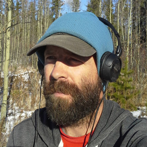
Forest measurement and data collection
Project Goal
Design a professional, attractive logo for an existing consultancy group which looks and feels like a modernized version of their old logo.
My Experience
The client requested that I incorporate elements of his old logo: mountains, trees, and a compass. These elements felt too busy in the existing logo, so I worked to reduce those elements, without losing the impact.
I chose fonts that I felt would represent the brand well, fonts that are bold, strong, and could be long-lasting, just like the forest… just like the foresters. From the typefaces that I presented, the client chose one that we both feel is perfect for the brand, which coincidently is named like a beautiful wood − Ebony.
The Outcome
With a brand new logo, my client is now equipped to print T-Shirts, Hooded Sweaters, Mugs, and more to outfit his team of foresters.
Software Used